[ad_1]
Space is hard to come by in New York, a struggle designer and former NYC resident Liza Kuhn knows all too well. So, when a young professional tapped her to renovate his 450-square-foot Greenwich Village duplex, she was up for the challenge. “It was such a fun project because those of us that have lived in New York, we understand the problems,” says Kuhn. “It’s the beauty and the stresses of living in New York!”
Despite a limited footprint, the goal for the project was, “to maximize comfort and convenience, but to also have a sense of luxury,” says the designer. But given the apartment’s location in a pre-war building built in 1849, the unit was busting with structural issues. “It was in complete disarray,” explains Kuhn. “He really wanted to bring it back to life in an interpretation of how we live today.”
A gut renovation allowed Kuhn the freedom to customize a layout that better maximized the small footprint. “In these older buildings, you’re essentially constrained by whatever the footprint is,” says the designer. “But I would joke that it’s gonna feel like the biggest small apartment you’ve ever seen.” And by all accounts, it is!
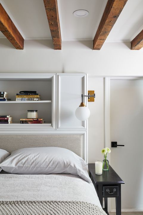
In the bedroom, a wall of built-in shelving and under-bed storage make up for a lack of closet space, while a custom headboard designed to open at the top holds extra pillows and blankets. In the kitchen, full-size appliances, rather than the compact versions typically found in apartments this size, make the space feel more like a home than an apartment. Kuhn even managed to squeeze a compact banquette into the living room, so the client would have a proper space to eat without sacrificing square footage to a dining table. “Its 450-square-feet of maximized space,” says Kuhn.
Read on to see how it all came together.
Kitchen
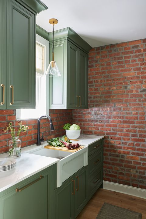
“He really wanted it to feel like a luxurious kitchen that you would find in a suburban home,” says Kuhn. On his list of must-haves: full-size appliances and painted cabinetry, both of which Kuhn delivered on. “He didn’t want to sacrifice any of those modern amenities, despite its size.”
As for the color palette, Kuhn recalls, “it was definitely more of a push.” She adds, “he really wanted a deep navy,” but a recently uncovered brick wall original to the building’s construction forced the designer to pivot. “When we found the brick, we had to shift gears a little bit because a blue wasn’t gonna work quite as well.” Inspired by a tree-lined courtyard adjacent to the apartment, Kuhn ultimately landed on Farrow & Ball Skimming Stone paired brass accents and natural finishes. “We wanted to bring that feel of nature and greenery into the apartment somewhere. And it seemed to really make sense in the kitchen.”
Bathroom
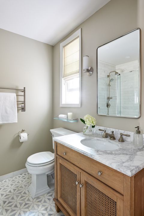
The original layout featured an awkward combination shower and tub that took up the bulk of the bathroom. To open up the space, Kuhn reconfigured the layout to include a walk-in shower tucked along the wall across from the vanity. Other luxe touches, like a heated towel rack and gradient flooring, make the space feel lavish. “He really wanted this to be a luxurious retreat.”
Bedroom
“The ceilings were only six feet tall,” Kuhn says of the downstairs bedroom. “The client could stand up and his hair was almost brushing the ceiling!” Kuhn raised the ceilings in the bottom floor dwelling and outfitted the space with vertical storage, “to give him at least a little bit of floor space to be able to move around.”
Follow House Beautiful on Instagram.
This content is created and maintained by a third party, and imported onto this page to help users provide their email addresses. You may be able to find more information about this and similar content at piano.io
[ad_2]
Source link


